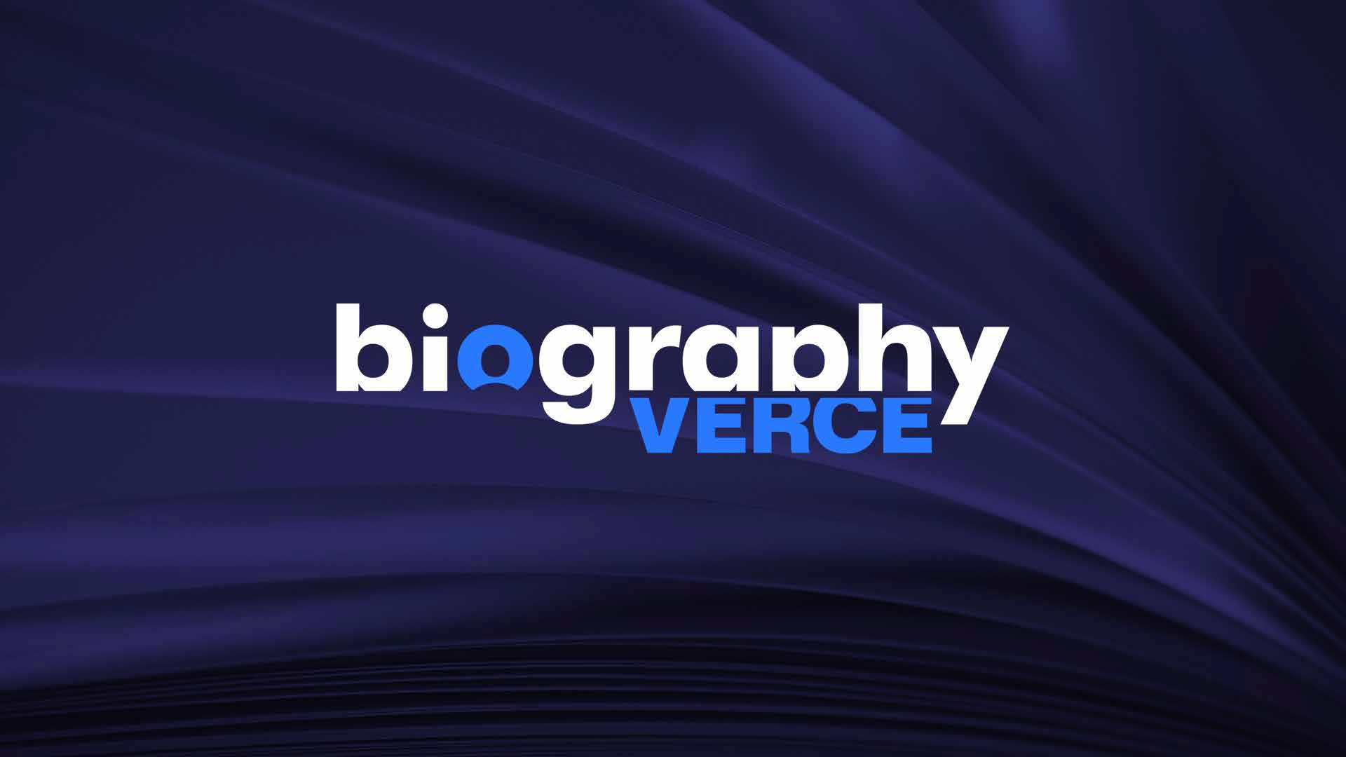
BiographyVerce
A cohesive logo, brand identity, and web design that consistent visual presence across platforms.
BiographyVerce is a web application designed to make the biographies of popular and motivational individuals more accessible for everyone around the world. The task was to create a visual identity for the project that corresponds with its purpose and is a good ground for development in the future.
Understanding the Challenge: From the outset we focused on understanding BiographyVerce’s mission and audience. The platform’s content is rich, narrative, and people-centric, so the visual identity and web experience needed to feel approachable, clear, and engaging. We started with research into comparable platforms, user expectations for biographical content, and the tone BiographyVerce wanted to set for its visitors. This informed both our branding and web experience decisions.
What we did
Brand Identity & Logo Design
Developed a distinctive and cohesive brand system that gives a clear and memorable visual voice.
Graphics & Motion Design
Created dynamic visual elements to enhance storytelling and engagement across digital touchpoints.
UI/UX Design & Web Development
Responsive web portal that ensures seamless navigation and a user-focused experience.
Crafting the Brand Identity
The first challenge we faced was designing a logo and identity system that had enough strength and clarity to function as an independent entity. We wanted our design concepts to be based in clarity and storytelling and convey both personality and purpose in our logo.
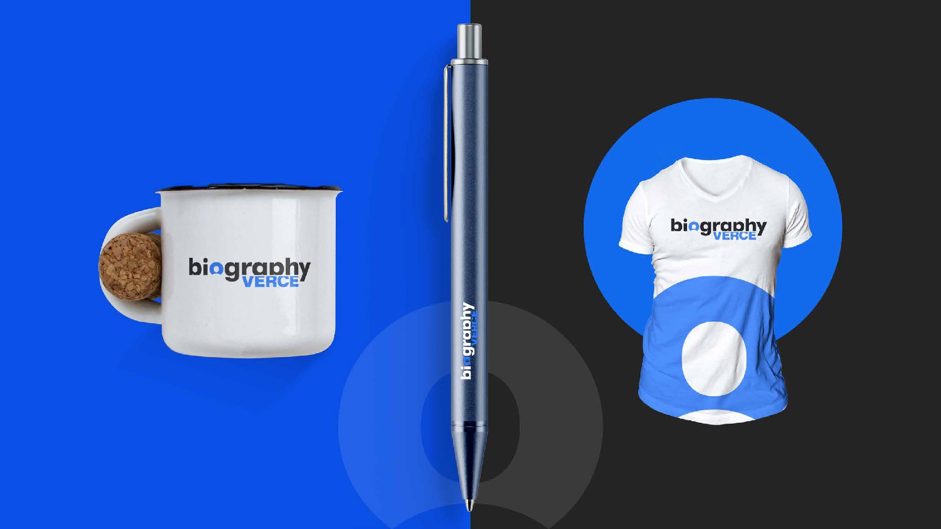
With the logo in place, we implemented supporting elements of the brand that include:
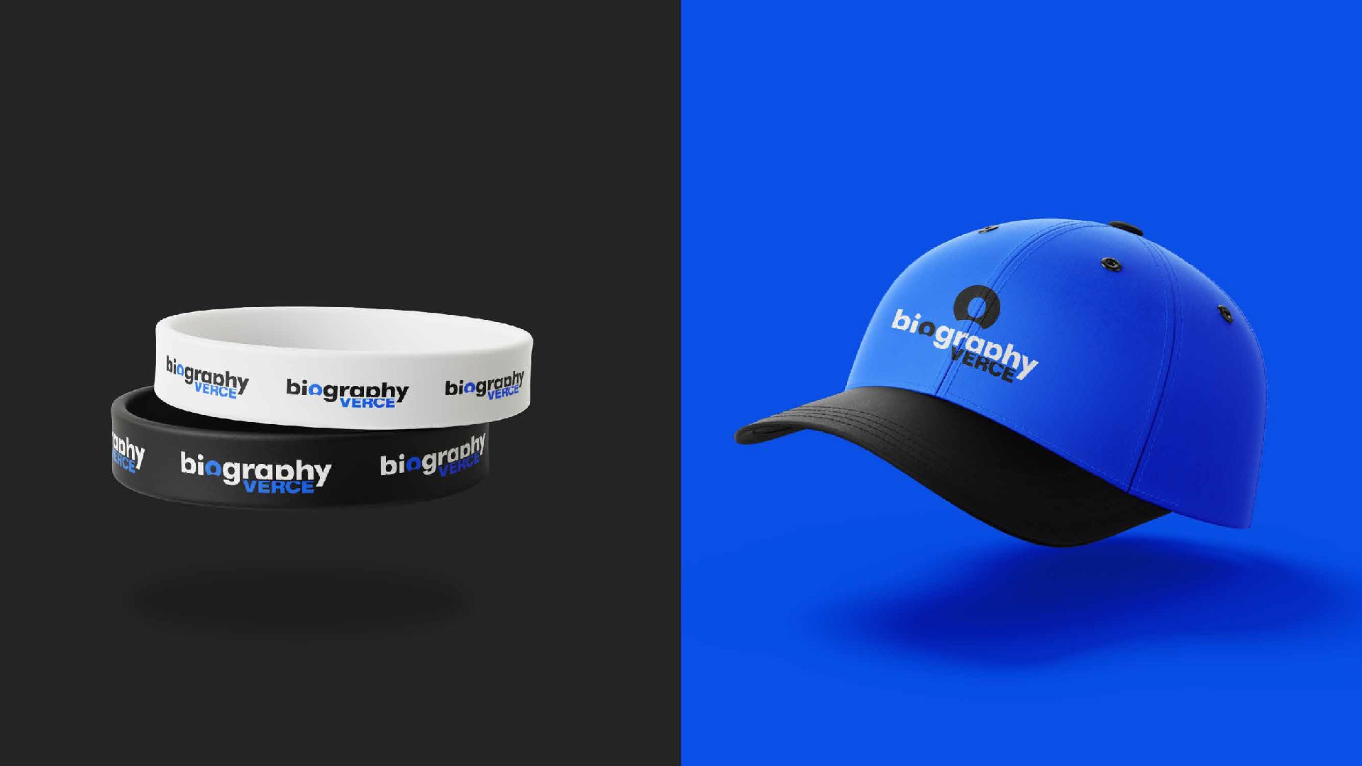
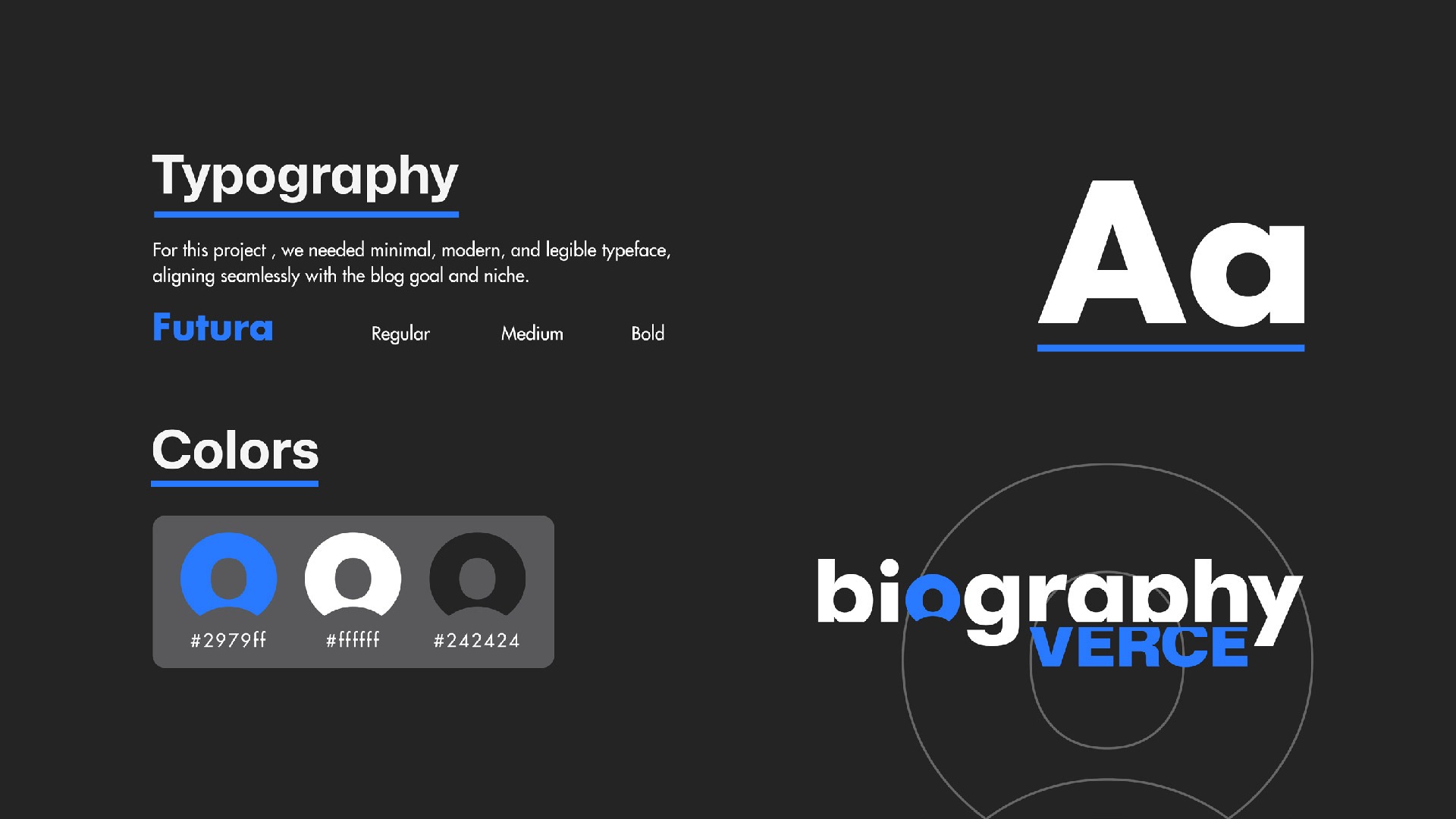
A flexible color palette chosen for contrast and accessibility
Typographic systems optimized for readability across screens
Graphic motifs that could extend into digital and print use
These components have been used to craft a consistent identity that could be applied across various online platforms, such as websites and other marketing campaigns that may be undertaken in the future.
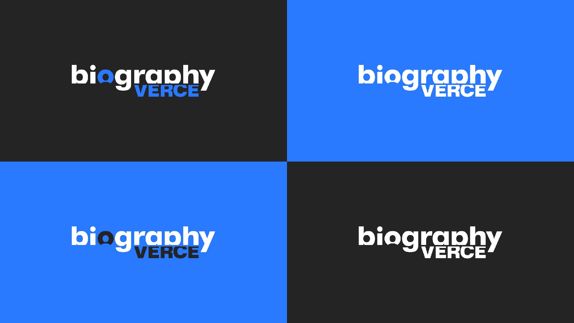
Brand Logo Concept & Brief
The design contains a simple wordmark, in which most of the letters of “Biography Verce” have been partly cut off but only the “G” and “Y” remain in “biography”. These small changes show that things are never quite done and that there is always room left for growth and learning. Additionally, clever letter-playing is incorporated into the design. The “O” is made for the purpose of creating a negative space image of a person. The versatility of such a design is seen in its ability to serve as a brand favicon. The aim of the design of “A” and “P” is to have them designed such that they look like each other in a mirror except that the leg of “P” is shortened to balance visually. It may arouse suspicion of incorrect pronunciation at first, but the misuse of letters will not affect the recognition of “biography” because we are used to reading it.
Since the brand is focused on biographies, the identity design should have an academic feel and be inspiring. It should be able to scale across different display sizes hence needing to be minimalistic, and timeless so that it can be used on different sizes of displays.
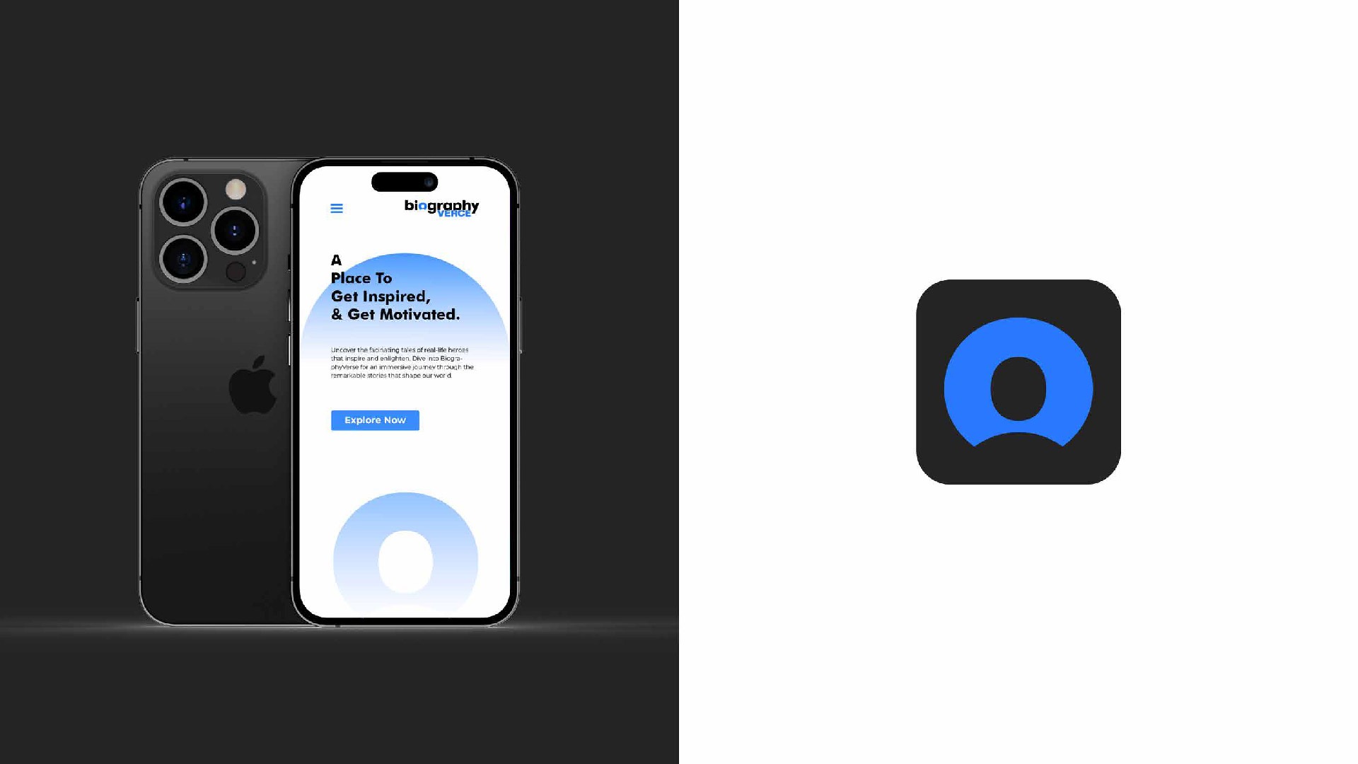
Designing the Web Experience
With a strong brand foundation in place, we moved into web design. The focus was on structure and user experience. We developed page layouts and UI patterns that support easy reading, intuitive navigation, and clear visual hierarchy. Content presentation was central, so our design prioritized:
Clean layout structures with thoughtful spacing
Typography optimized for long reading sessions
A navigation flow that supports discovery and depth
Prototypes were tested for clarity and ease of use, and refined based on feedback to make sure the experience felt natural and helpful for visitors.
Development and Delivery
Once the design direction was approved, we moved into development. The website was built with responsiveness and performance in mind, ensuring users on different devices and network conditions would have a smooth experience. Throughout the build we verified that the visual identity was faithfully translated into code, and that interactions felt polished and consistent.
What We Delivered
At the end of the engagement Yeti Studio delivered:
A distinctive logo and brand identity system
A structured and engaging web design focused on content clarity
A responsive, user-focused website built for performance and scalability
The final product gives BiographyVerce a clear and consistent visual presence, and positions the platform to grow its audience with confidence.


 using WordPress and